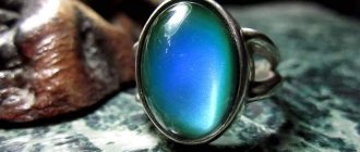
According to experienced craftsmen, the saleability of handmade jewelry depends only 30% on the idea and the quality of its implementation and 60% on their photo presentation. Experts attribute the remaining 10% of success to other subtleties of trading. The ability to create beauty is meaningless without a profitable visual presentation when it comes to selling costume jewelry. How to photograph a piece of jewelry so that it “plays out” and doesn’t get lost among the many other offers?
Let's start with the fact that it won't be easy. But let’s immediately dilute this bitter pill with the bold statement that to beautifully present the finished product, it is not necessary to have expensive cameras and complex equipment. Working with jewelry for a glossy magazine and taking photos to display handmade jewelry are not only different weight categories, but also largely contradictory tasks. And their target audience is often completely different.
About black and white backgrounds and lightboxes
Pure white or deep black backgrounds give a photo a commercial feel. This is something that is welcome in the presentation of precious products, but something that detracts from the perception of handmade jewelry. The advantage of such photographs is that they focus attention on the main thing and do not dissipate it into additional details. But this kind of photo depersonalizes the decoration and does not convey any personal experience to the viewer. And in handmade products this is important. The last point in the controversial issue is put by the resource on which the product is offered for sale. If this is an online store, a white or black background is quite appropriate. For those who maintain a personal blog, this is rather undesirable.
All this in no way eliminates the use of lightboxes - special box devices for creating scattered (diffuse) light. Such lighting not only helps to better develop the depth and detail of the decoration, but also to minimize defects that visually form in the places where light transitions into shadow.
Photo boxes are easy to make yourself (for handmade craftsmen this is definitely not a problem). Comprehensive information with master classes can be found online. In this case, it is better to replace the flash with illumination from the outside of the box, for which ordinary household lamp models are suitable.
Watch out for glare
Jewelry photography can be especially finicky when it comes to silver, gold, or some other shiny metal. This surface reflects both the blinking from the softbox and the flash, so in the end the light can ruin the photo. To avoid unnecessary reflections, try tilting the softbox or flash at different angles. You may have to open the aperture all the way, but you will avoid direct highlights. It's normal to have some light on the edges and sides of the piece, but it looks unprofessional when it reflects directly onto the surface.
Use natural light whenever possible and you can avoid the problems associated with using flash. When shooting in a studio, you will need a tripod and constant light sources. This technique allows you to reduce the shutter speed as much as possible, but the camera must remain motionless.
Rule of thirds
It consists in placing important objects not in the center, but on one of the lines that divide the frame into 3 parts horizontally and 3 vertically. Typically, camera models provide the ability to display this grid on the screen. And here an important nuance awaits us! If a photo of handmade jewelry is taken against a plain background, this rule does not work! It should be placed in the center. The exception is products like necklaces, which must be placed entirely in the frame, but have a more significant part and a secondary one (chain, cord, etc.). However, even in this case, sometimes the technique of exact symmetry in the center of the frame works great. But only when the product itself is symmetrical, which is very difficult to achieve with manual work. Please note that with such a feed, all distortions will be evident.
Photographing objects: seven-branched candlestick
The seven-branched candlestick (Heb. menorah) was the most important accessory to the tabernacle, and later to the Jerusalem temple. The Lord commanded the prophet Moses: And make a lamp of pure gold (Ex. 25: 31). The first seven-branched candle weighed 35 kg. The seven-branched candlestick looked like a stem supported on a stand. On its branches were seven lamps filled with pure olive oil. The lamps were lit every evening and burned all night: from evening to morning (Lev. 24:3). Seven-candlestick... Continue reading “Photography of objects: seven-candlestick”...
Composition: emphasize the important
Additional accessories should be used with extreme caution so that they do not “clog” the main thing. Composition is the thing’s own story, and it should be clearly visible and set an emotional background. You can (but very carefully) use ceramic tiles, wrapping paper, fabrics, stones, driftwood, ethnic items or even chocolate chip cookies - but all this requires impeccable taste, a sense of style and a sense of proportion. Remember that even a compositional technique that is impeccable from the point of view of photographic art may turn out to be weak in terms of a profitable visual presentation of an object for sale. The baby thrown out with the bathwater is precisely this case.
Wonderful photographic objects
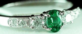
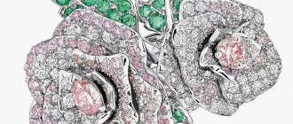
Choose flawlessly cut stones or extremely beautiful jewelry for photography. A well-cut stone will not scatter light, preparing for photography will take less time and it will be easier for you to capture it at its best. However, it is always useful to remove the jewelry from different angles and always from the front and back sides.
Left: Jeffrey Appling designed and photographed this green and rose gold two-tone tourmaline ring with tsavorite garnet, pink sapphires and natural yellow diamonds. Right: diamonds from the Oppenheimer collection - on the left, a twin crystal weighing 22.01 carats - on the right, a faceted diamond weighing 1.01 carats (gift of De Beers). Photo: Robert Weldon.
Follow the odd number rule
An odd number of items looks more advantageous and visually attractive. It looks more natural and easier on the eyes. This is not a hard-and-fast rule, and frankly, there are many situations where it doesn't work. But earrings with a bracelet always look better than without them (we are talking exclusively about the photo). At the same time, photographing earrings one at a time is not an option at all. Sometimes a background object saves the situation, but it should not pull the blanket over itself. Its role can be played by a telephone, a box, a mannequin of a woman’s head without a clear outline of facial features, and anything else that is larger in size and is out of focus.
2. Focus
Use the camera's built-in exposure meter if the design provides one, and select spot/partial exposure metering. The camera will expose a certain area of the frame (approximately 8–10% of the total) and determine the desired exposure level based on the results obtained.
Why is the standard setting for digital cameras not suitable for matrix, or evaluative, metering? Because the automation will try to “average” the entire scene and expose the entire image as “correctly” as possible. While this technique is universal for photographing landscapes or even portraits, it is absolutely not suitable for photographing jewelry. Small stones and Swarovski crystals need to be photographed with a more precise focusing mode, which means the camera needs to be set to spot metering.
Glare on the edges of the crystal can confuse the camera's autofocus, so the photographer should use the manual focus mode. Absolutely - using a tripod becomes mandatory.
Color combinations as a compositional tool
The color perception of the human eye is a subject of special study for graphic designers, fashion designers and, of course, photographers. And undoubtedly, handmade jewelry makers too. Certain combinations of colors can either complement each other favorably or ruin the whole impression, literally hurting the eye. It’s especially disappointing when a decoration that is impeccably executed from this point of view is hopelessly spoiled by an incorrectly selected background or compositional presentation.
Props
Use props to represent the subject. A cameo on the cover of an antique book, for example, conveys a sense of historical significance. Make sure the colors of the props help the jewelry stand out or complement the painting. You can also use props to show the actual dimensions of an object in relation.
Left: Weldon uses books from the museum's Carlsbad Library display as a backdrop for a brooch provided by Elisa Misiorowski. Right: A rectangular amethyst cushion with a pearl brooch photographed on blue fabric (brooch courtesy of KCB Natural Pearls). Photo: Robert Weldon.
Size matters
Photography allows you to be very flexible with the size of an object. Jewelry, like any other thing, can be visually presented so that it looks much larger or much smaller than its actual size. What task is in your case is up to you to decide. However, visual deception of the buyer is often punished by negative reviews and loss of reputation of the seller. If you don't need it, find a way to show the actual dimensions of the jewelry and give the buyer the opportunity to evaluate the real size. For example, due to the presence of objects of standard perception in the frame.
Tools
Camera and lenses
Use high-end digital single-lens reflex (SLR) cameras capable of capturing images at 16 megapixels or higher.
A 60-80mm macro lens with 1:1 magnification capability will allow you to focus on an object from a distance of 13 centimeters or more. Weldon himself traditionally uses a 105mm lens. Victorian gold serpent bracelet (circa 1875) with a special weave, goldsmith's mark, gold engraving and diamond eyes. Gift of Mona Lee Nesset. Photo: Robert Weldon.
Lighting
Studio strobes, continuous lighting, LED lighting and simple flashes provide a variety of lighting options. You need to carefully set up the lighting system and watch how it affects the appearance of the jewelry and interacts with them in reflections.
Scene
Set up a site or area where you will photograph the subject. You can use prefabricated light boxes, or you can build an awning or a cocoon of translucent plastic out of white fabric in order to control the environment and create diffused light around the photographic object, soften the shadows and ensure its uniform illumination.
Creating a stable light environment and organizing a photography site - these recommendations are suitable for appraisers and jewelers who are collecting a catalog of work or inventory, that is, capturing jewelry in a typical environment so that the original under normal conditions does not differ from its photograph shown to the client. However, this approach is practically devoid of creativity and artistic origin.
Large Bolivian Amterine weighing 201.06 carats. Courtesy of designer Michael M. Daiber. Photo: Robert Weldon.
Tripod
A tripod will help eliminate camera shake and, combined with continuous lighting, will make it easier to capture the best possible photo.
Tweezers, sticky wax or tape and gemstone wipes
Sticky wax or tape will come to the aid of the photographer during working moments, for example, when focusing the lens on the scene. As in gemology, gemstone wipes are an invaluable aid in cleaning gemstones and removing dust and fingerprints from them. Tweezers are used to install jewelry to avoid the appearance of new prints on the surface of the stone after cleaning with a napkin. Since the photograph is using macro photography, make sure that there are no distracting details left on the subject.
How to photograph jewelry: ideas
be patient
Try and try. Malcolm Gladwell, author of the book “Outliers” (in statistics, outliers of experimental values are called that) introduces the “ten thousand hours” rule, saying that the key to success in any field is associated with completing a certain task for ten thousand hours. Applying this expression to photography, perfection comes after ten thousand photos taken.
Bulgari's platinum flower bouquet brooch is set with 47 natural colored fantasy-cut diamonds for a total weight of 29.38 carats. The piece was created in New York by Max Halpels and was loaned for photography by the Royal Ontario Museum in Toronto, Canada. Photo: Robert Weldon.
What background is not suitable for photographing your jewelry? Part 1
For 6 years now I have been photographing my jewelry myself, I am self-taught. I started with a regular point-and-shoot camera, then I spent a long time taking photographs with a simple DSLR, and now I use my phone more often. In my photographs I used completely different backgrounds in color and texture.
We all understand how important photographs are when selling online. And now you have the equipment, the decoration is done, it’s time to take pictures. You need a suitable background.
Today I will tell you, based on my experience and my experiments :), which background is best suited for your jewelry, and which one is definitely not. And I’ll start, perhaps, with the main thing - BACKGROUND COLOR.
Let's look at the advantages and disadvantages of the most basic ones, generalizing the colored ones.
1. White. The most common and most finicky background when shooting and processing.
Advantages:
+ a white background is great for shooting a catalog or online store, where nothing should distract from the product itself;
+ suitable for shooting wedding and romantic decorations, where you want to create the effect of lightness, weightlessness, and add “air” to the frame;
+ according to the psychology of perception, a white background is more pleasing to the eye, unlike a dark one;
+ judging by the collections and the main page of the Masters Fair, a white background is in great demand here :).
Flaws:
— for social networks, where emotions and visuals rule, a regular white background will be boring and will fade against the backdrop of interesting photographs. In this case, it is better to complement the white background with props;
- you definitely need to be able to adjust white balance and/or work well in editors, because... the white background may turn yellow, blue or gray. The white background should also be white in the frame;
- not suitable for every piece of jewelry, this definitely includes the Gothic style and men’s jewelry (especially brutal), unless this is an ordinary catalog shoot.
2. Black. Many people avoid it; not everyone knows how to work with it, considering it difficult.
Advantages:
+ a black background evokes associations with “expensive” and “luxury”, respectively, your jewelry can evoke similar associations among buyers;
+ decorations on a black background look more contrasting;
+ does not require more effort when processing photos.
Flaws:
- black color is perceived worse by the eyes than white;
— it’s difficult to work while shooting, because any specks of dust are visible;
- definitely not suitable for wedding and children’s decorations (you will need a good idea and composition if you choose a black background), for romantic decorations in most cases (presentation is important here).
I chose the difficult path - floral decorations (romance) on a dark background, but sales did not fall. It is important to present the product correctly.
3. Colored. A large selection of colors with which you can play and convey the mood of the product. Pastel, powdery and dusty shades are more universal.
Advantages:
+ large palette of colors from delicate pastels to bright or deep;
+ does not require much effort when shooting and processing;
+ you can get by with a small amount of props;
+ a colored background is suitable for shooting any decoration; the idea and presentation are important here.
Flaws:
— if you use many different colored backgrounds, you can easily lose the uniform style of the store;
— you need to clearly understand what background color will suit the decoration without overshadowing it. Delicate pastel decorations are easily lost against a bright background.
4. Gray. Not so long ago it became popular and was even in hot trends at one time.
Advantages:
+ does not cause any particular difficulties when processing photos;
+ serves as a background for your decoration, without drawing attention to itself at all, but at the same time adds contrasts, unlike white;
+ when putting together the right composition and angle, the decoration looks stylish;
+ neutral background, universal.
Flaws:
— the main disadvantage of a gray background is that it can be absolutely boring in the frame and not evoke emotions in relation to the product.
As can be seen from the above, choosing a background is not as simple as it might seem at first glance. Some people think “I’ll buy a white background and that’s enough,” but in fact it turns out differently. It depends on the purpose of the shot, the style of decoration and your skills.
The decoration must not only be made, but also photographed correctly.