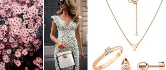
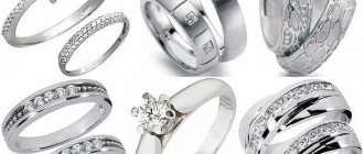
Sergey Khrameev: Layout of decorations: “God level!”
02/18/2019 Sales 3890
Sergey Khrameev
Other expert publications:
- Sergey Khrameev: Promotion of a jewelry brand on social networks. Specifics and capabilities
Buying jewelry is not an impulse purchase and is usually planned in advance. While in the salon, the buyer takes what he sees first (for example, what evokes associations, what his gaze falls on), or what the sales consultant recommends, or a brand that is familiar to him = heard. The assortment in the jewelry salon is not small - the display cases are full of jewelry, including with decorated sales areas.
“Why are they, these “registered zones”!? There are tablets - put them in a row and OK! There is a client, there is a product. What else is needed!?" To this we will answer you the following:
Naturally, almost every manufacturer takes care of this. What is there ? But everyone has their own characteristics. We will speak for ourselves. About our “GOD LEVEL” for displaying jewelry from the GRAF RINGS brand and share the basic rules.
If it’s a burden for you to read this “writing” and in the display above you there are only “stars” - DO NOT READ. And immediately download the merchandising book in its demo version for jewelry stores that have our jewelry => apply it in practice. Everything there is simple, like in a pharmacy: where to put it, how to register.
And for those who are still reaching out, together with us, to the top of jewelry - we continue to write, narrate, and educate. So, let's go.
The closer the store format is to a mass market, the larger percentage of the total display area will be occupied by mass display: 80% tablet display of mass-produced goods and 20% composite display in the departments of expensive goods with precious stones. This ratio is recommended for mass-market stores. And vice versa, 80% of the composition display and 20% of the tablet display characterize the display of a luxury salon, Wed+ offering high-value products.
In branded salons and designer boutiques, 100% compositional display is found, since each product is unique in its own way and requires a special presentation.
The more expensive, unique, exclusive products you demonstrate, the more effective the use of composite display will be. Conversely, the presence of a tablet display visually signals to the buyer that the store offers products at affordable prices.
It is clear to the buyer at first glance what kind of store is in front of him. Thus, a flow of target buyers is formed. In addition, when applying this law, the buyer can easily navigate in which place of the trading floor there are cheap goods of mass demand, average in price, and where expensive exclusive products are presented.
- In the “hot” zones—the center and the upper right corner—especially promoted product groups (so-called “soloists”) should be displayed.
For what? The buyer pays special attention to these areas! They can contain both exclusive, status, expensive jewelry, and products for which you are running a promotion.
- In the “cold” zone of the display case - the lower left corner - it is necessary to place goods of priority demand, products that attract attention with their design, large-sized products, and information signs.
Each product group in the display case should have clearly defined boundaries, surrounded by free space (emptiness). An excessive amount of goods in a sales window does not allow you to allocate free space for demonstrating product groups expressively and separately.
The desire to show everything at once destroys the clarity of the display. Emptiness is a tool with which you can concentrate the buyer’s gaze. Please note that high jewelry fashion salons actively use this: the more expensive the product, the greater the percentage of emptiness left around it.
Simple solutions are perceived by the human subconscious as the most correct. The display should be clear, simple, with a clearly identified central semantic element, so that the viewer can understand which product is the main one.
Important! The seller could easily get into the depths of the display case, and the buyer could clearly see all the corners of the display case. Products should not overlap each other; it is important to observe the principle of legibility of each decoration.
The most expensive products are placed in the semantic center of the display window, above other products. To do this, we recommend using additional stands and podiums, or highlighting them in contrast with a different color. In vertical showcases and niches, expensive products should be placed at eye level. They form the image of the store, as they are in the zones of the most active perception.
The point of using display equipment is to show all the elements of a piece of jewelry as effectively as possible. By lifting the product onto the equipment, we emphasize its value and give it special meaning. That is why displaying jewelry at the bottom of a counter or shelf is absolutely unacceptable!
They are placed in the background, delicately emphasizing and accompanying the main thing - the jewelry. The purpose of the decor is to attract impulsive attention at a long distance, it works in a split second, and when the buyer approaches the display window, nothing should distract his gaze from the product. Therefore, we always place the decor, as well as advertising posters, behind the display equipment, on the backdrop, in the air above the exposition, but never on the first line of the exposition!
But the place for information signs is the lower left corner of the display case or display area. The decorative filling of a display window should not be too complicated; one or maximum two decorative elements are enough to perform the function of impulsively attracting attention.
Gallery
Display of goods according to the rules of jewelry merchandising
Stores in the “mass market” and “middle market” segments are characterized by the so-called flatbed display: identical medium-sized counters are located along the perimeter near the walls of the sales area. Products of the same product group are placed on one tablet, tablets with similar products are placed on the same counter. Multi-level display helps save space in the display case/on the tablet.
Jewelry merchandising requires that customers move comfortably around the store without interfering with each other. The sequential arrangement of goods from various trade groups is justified, since moving from display case to display case, the buyer will see almost the entire assortment offered.
To avoid the feeling of similarity of the jewelry on display, it is recommended to use elements of compositional display and decor in each display case. Jewelry merchandising determines that the more expensive the displayed group, the greater the proportion of compositional display for this product.
The compositional display effectively represents jewelry sets or jewelry collections. It should be created taking into account color schemes and artistic laws of composition. Jewelry merchandising claims that an object located in the center attracts maximum attention - lines need to be drawn from it, along which the buyer’s eye will move.
Features of jewelry store equipment
Serious attention should be paid to the interior design and quality of equipment for displaying jewelry. Jewelry merchandising recommends thoughtfully maintaining a single style, maintaining the color scheme of the store, thereby creating its special atmosphere.
The equipment must meet high aesthetic requirements, but at the same time be absolutely functional. The seller should not have the slightest difficulty opening the display case and displaying the goods (at the same time, safety rules must also be observed).
Jewelry merchandising dictates high demands on the quality of lighting: bright, even light from the white part of the spectrum. For display cases with particularly valuable jewelry, additional lighting is desirable. Accent spot lighting makes it possible to demonstrate the features of the shape, color of products, and cut of stones.
Main criteria
When decorating jewelry store windows, you should follow the rule - do not overload it with products! If you place a small number of rings and earrings, each of them will be perceived as something unique.
More attention is paid to such an installation; purely psychologically, it seems that an object that is displayed in splendid isolation is more valuable.
Abroad, the assortment on display in jewelry stores changes weekly. In fact, this is done not even to completely replace the product range, but to draw attention to the very fact of the update.
In order for a showcase to attract and sell, you should adhere to a number of rules when designing it. The right showcase is different:
- ideal color scheme;
- thoughtful lighting that is relevant at any time of the day;
- laying out jewelry according to all the rules of composition.
Now, in more detail about the rules of composition, there are only three types of installations:
- “3-5-8” – large decorations, medium and small items are placed on the display case at once;
- stairs - all objects are placed at different heights;
- row - decorations are arranged in a straight line.
In this case, the most expensive and valuable jewelry is located in the center; secondary objects may be located slightly below eye level. There is enough free space between them, there is no need to save space!
Jewelry merchandising from MERCH4U
The MERCH4U agency offers professional merchandising management in jewelry stores. Sixteen years of experience and a strong technical background have combined into deep industry expertise, which we use to successfully develop your projects:
- We work with networks across a wide geography, covering more than 700 cities in Russia,
- We use innovative IT solutions to optimize the display and control of residues,
- We practice a flexible approach to analytics and statistical data, collecting maximum useful information for your marketing.
We take on standard projects and complex tasks that others have failed to cope with. Tell us about your plans by phone. or we will offer a profitable and convenient solution for jewelry merchandising.
Jewelry merchandising: general recommendations for a retail outlet
- the use of decorative elements consistent with the general style of the outlet - flowers, mannequins, stands, boxes, etc.;
- bright external lighting (with excellent internal light) - bright light attracts and motivates you to buy;
- an open overview of the entire assortment of jewelry at a distance that is physiologically most favorable for examining small details. The average height of the jewelry display case should be at the level of the elbow of a standing person, and the depth of the display case should not exceed 50 cm;
- using different decoration display techniques for products of different price segments. Jewelry merchandising dictates requirements for price tags: they must be clearly readable, but not obscure the product.
Jewelry with and without precious stones is placed in different display cases if possible; the same rule applies to jewelry made from different precious metals; gold products are additionally sorted by standard. Separate display cases/tablets should be allocated for jewelry.
The use of contrasting color substrates and holders allows you to demonstrate jewelry most effectively.
A mandatory element of a jewelry store should be high-quality mirrors in sufficient quantity, their placement should be as convenient as possible for the buyer.
Cost of services offered:
| Merchandising services | Visits/days per week | Moscow | Saint Petersburg | Other cities |
| Discounters (from 20 minutes per visit) | 5 | 140 rub. | 135 rub. | 130 rub. |
| 4 | 145 rub. | 140 rub. | 135 rub. | |
| 3 | 150 rub. | 145 rub. | 140 rub. | |
| 2 | 155 rub. | 150 rub. | 145 rub. | |
| 1 | 160 rub. | 155 rub. | 150 rub. | |
| Supermarkets (from 25 minutes per visit) | 5 | 142 rub. | 137 rub. | 132 rub. |
| 4 | 147 rub. | 142 rub. | 137 rub. | |
| 3 | 152 rub. | 147 rub. | 142 rub. | |
| 2 | 157 rub. | 152 rub. | 147 rub. | |
| 1 | 162 rub. | 157 rub. | 152 rub. | |
| Self-service stores (from 30 minutes per visit) | 5 | 145 rub. | 140 rub. | 135 rub. |
| 4 | 150 rub. | 145 rub. | 140 rub. | |
| 3 | 155 rub. | 150 rub. | 145 rub. | |
| 2 | 160 rub. | 155 rub. | 150 rub. | |
| 1 | 165 rub. | 160 rub. | 155 rub. | |
| Retail outlets/chains, including local ones, remote from the city (from 30 minutes per visit) | 5 | 150 rub. | 145 rub. | 140 rub. |
| 4 | 155 rub. | 150 rub. | 145 rub. | |
| 3 | 160 rub. | 155 rub. | 150 rub. | |
| 2 | 165 rub. | 160 rub. | 155 rub. | |
| 1 | 170 rub. | 165 rub. | 160 rub. |
Methods and principles of displaying jewelry on commercial and technological equipment.
Let's consider one of the components of merchandising - product display.
The counter is the most revealing part of a jewelry store’s equipment and therefore it must match the style and quality of the entire store concept.
The classic type of counter is a counter with a glass lid. The main task is to choose the right height: the buyer should not bend too low or have difficulty inspecting products lying at the back of a counter that is too high. The optimal height is from 100 to 120 cm from the floor level. At the same time, the display counter can be placed not horizontally, but at a slight angle to the buyer, which allows you to focus the eye not only on the central and front rows, but also on the products located in the back of the hall.
Small and numerous items, such as jewelry, can easily get lost if poorly displayed. A well-laid product is one of the reasons for the good demand for it. When the goods arrive at the warehouse, the first thing they do is sort them into product groups and categories, for example - rings with inserts and rings without inserts, rings with inserts made of precious stones - with inserts made of cubic zirconia, colored stones, rings without inserts - into engagement rings and shaped and etc.
After sorting the goods, it is easier to organize them into groups that are understandable for buyers and use the space of the hall taking into account the rule of the “golden triangle”. The basis of this rule is the placement of the basic category of goods that are in greatest demand (products with cubic zirconia, wedding rings) along the wall opposite the entrance.
There can be several vertices of such triangles, depending on the types of popular products. Using this principle allows you to look around the entire trading floor and make unplanned impulse purchases.
The most common display is for the following product groups: chains, rings, earrings. This display is simple and understandable to every buyer, it is easy to navigate. But she is devoid of emotionality and expressiveness. To make the display interesting and successful, several bright images and details are added to it, attracting the attention of buyers and forcing them to examine the entire assortment. Compositions can be created in separate showcases. Compositions should be created on a specific topic. The purpose of such compositions is to give customers positive emotions and inspire them to make a purchase. Artistic compositions should be updated and changed to maintain the impression of a constantly updated assortment. If the assortment does not change very often, then the update effect can be created artificially by simply rearranging the decorations in your group.
If some jewelry is not selling well, you can place it in the center of a display case with popular products, and they will be immediately noticed and purchased. This technique is called the “popularity borrowing effect.”
General rules for window display design:
Buyers associate cleanliness and order with quality and professionalism;
The product must be positioned facing the customer and not block one another; each product must be provided with favorable lighting;
Exhibition accessories, price tags and labels must be neat;
Signs and information plates must be located horizontally and centrally above the products of this group;
The new product must be highlighted with a special sign.
You can distribute products into categories. The division of goods into categories is associated with different types of demand for individual groups of goods. This division makes it possible to most fully satisfy the needs of all groups of buyers, because each group is related to their interests.
The following categories are distinguished:
A unique product - expensive diamond jewelry - provides the store with an image and satisfies the extreme needs of customers.
Priority - products with colored stones - provide high revenue; there is a rich assortment within the category.
Basic items – chains, bracelets, wedding rings, products with cubic zirconia – make up the majority of purchases and have a higher turnover.
Occasional - piercings, ankle bracelets - seasonal goods.
Convenient - boxes, cases - gives the feeling of being able to buy everything at once, does not provide a big profit.
Place of each category in the hall:
Unique
– retail space of the highest quality, good lighting, away from the entrance, but in the area of the main consumer flow;
Priority
– high quality retail space – in the back of the hall, in the area of the main consumer flow;
Basic
– retail space of any quality – in different parts of the hall, clients will find them in any case.
Periodic
– for seasonal goods, it is better to place the entrance or checkout area not on the counter, but on separate special display cases.
Convenient
– places both at the entrance or exit, and near the ticket office.
The display process is creative and each store has its own characteristics. The main thing is to lay out the product so that the buyer can easily navigate it and not leave without purchasing.
Payment for goods is made in the form of cash or non-cash payment in the prescribed manner.
In case of return of goods, settlements with the buyer are made in the same order in which payment was made, unless otherwise established by agreement of the parties.
The rules for sales by bank transfer and payment on credit are presented in Appendices 3 and 1.
Equipment and lighting of a jewelry store according to all merchandising rules
For the buyer, commercial equipment provides comfortable conditions for choice. It helps the seller to present the jewelry favorably. The needs of both meet glazed showcases with flatbed display at a height of 1.2-1.3 m. Dimensions - width and depth - depend on the area of the trade and exhibition hall, and the classic functionality includes mirror panels to enhance shine, built-in lighting, retractable exhibition Part.
Island displays are typically taller than wall counters. Moreover, if the store’s assortment includes necklaces, chains, beads, necklaces and other products that look great on high busts and voluminous stands.
The central light of a jewelry store can be warm, soft and diffused, but for display cases and vertical displays, spot, specially designed lighting is recommended.
Ideally, an individual color temperature is selected for display cases with gold, silver and diamonds:
- gold, as well as gold with rubies and alexandrites, is illuminated with lamps with a color rendering of 3000-3500 K,
- silver and white gold benefit from cold light, so for display cases with jewelry made of silver precious metals, backlighting of 4000-6000 K is used,
- pearls, stones of cool colors (sapphires, emeralds, amethysts) and diamonds sparkle most brightly under light of 5000-6500 K and with a more intense luminous flux.
In large retail spaces, lighting not only represents decorations, but also zones the area. Using accent lighting, you can highlight the sector of new products or create a private atmosphere in the lounge area.
